|
J.T. Realmuto is the starting catcher for the Philadelphia Phillies, returning for a second season after being traded from the Miami Marlins after the 2018 season. He stands 6’1”, weighs 210 pounds, and is 29 years old. He made his MLB debut in 2014 and played his first full season in 2015. In his 5+ years of service he has been a 2x All-Star, 2x Silver Slugger, won a Golden Glove, and was named to the 2019 All-MLB 1st Team. This offseason he lost his arbitration hearing and was given a 1 year, $10M contract for 2020. It is his final year of arbitration and the Phillies are actively looking to sign Realmuto to a multi-year extension. Overall, he is a well-rounded player who has improved his production each year and is now considered the best catcher in baseball. His historical statistics can be used to identify his strengths and weaknesses and, combined with three-year projections, an assessment of his value can be made headed into those contract negotiations. Past Performance In order to assess Realmuto’s historical performance, three years of historical data were collected from Fangraphs [1] and Baseball Savant [2] for all players, catchers, and Realmuto for comparison. Statistics were chosen for Power, Contact, Arm, Glove, Speed, and Overall Value. Defensive statistics were not included for non-catchers as the values and inputs vary significantly by position. Only qualified players were included based on plate appearances from 2017 to 2019 which produced 234 players, 19 of which were catchers. The summary statistics for is shown in Table 1 below. 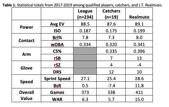 J.T. Realmuto isn’t labeled the “best catcher in baseball” on accident and these statistics highlight some of his strengths and why he is so valuable to the Phillies. Looking through this table he is above league average in every statistic and above average for a catcher in all statistics except rSZ and DRS. Realmuto is known for his ability to control the run game and his Caught Stealing Percentage (CS%) and Stolen Base Runs Saved (rSB) are the best numbers among qualified catchers. He also excels at the plate making hard and consistent contact shown by an Average Exit Velocity of 89.1 mph and 8.0 Barrel Rate. These above average raw skills produced a 0.199 ISO and 0.341 wOBA, both of which rank in the top 100 in that time span. Speed is a strength of Realmuto’s game that sometimes goes unnoticed. He has above average speed for the league, averaging 28.6 mph, an extremely rare skill for a catcher. This raw speed and high baseball IQ have led to Realmuto’s Base Running Runs Above Average (BsR) to be 11.8 which ranks 16th and makes his base running comparable to Ozzie Albies (13.1 BsR) and Kevin Pillar (11.5). Realmuto’s WAR shows how his above average tools and performance have created value, but the number of games he has played is also significant. Very rarely does a catcher play so often and with so few injuries. Only Yasmani Grandal has played more games behind the plate since 2017 and the gap between Realmuto and the next catcher is 38 games. Although this heavy usage could catchup to Realmuto later in his career, it is a clear plus now as a backup catcher is barely needed and finding a good backup is so hard to do. The data presented highlights Realmuto’s value as a well-rounded star and builds a strong case for his agent as they negotiate a new deal. Despite Realmuto’s exceptional skillset, his defensive statistics are below average compared to other catchers. His Strike Zone Runs Saved (rSZ), which is a measure of framing ability, is negative since 2017. That weakness is the main reason his Defensive Runs Saved is below average despite his rSB being so elite. Realmuto has taken notice of his shortcomings and focused on improving as a framer. His rSZ has improved each season, as shown in Figure 1, and was positive in 2019. Given his athletic ability and clear trend of improvement, expect his rSZ to continue to increase in the years to come. 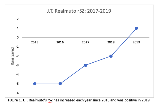 3-Year Projections Looking ahead in Realmuto’s career is of particular interest for the Phillies as they assess his value. Using a weighted average projection similar to a Marcel projection without regression or aging affects the statistics in Table 2 were projected for Realmuto’s 2020-2022 seasons. These projections are very simple compared to more advanced options and it should be noted that projections for 2021 and 2022 rely on projected statistics from previous years. 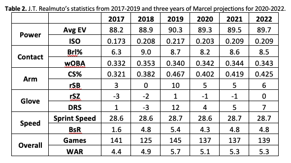 Because Realmuto has been consistent offensively over the last three years there isn’t a lot of dramatic change in his projected statistics. His ISO is projected to be safely above 0.200 and wOBA around 0.340. For reference, the more complex 3-year ZiPS projections [3] puts his ISO around 0.220 and wOBA around 0.340. Statistics that are measures of raw skill like Avg EV, Brl%, and Sprint Speed remain flat although adding an aging effect would eventually decrease these values and cause his performance statistics to decline with them. Realmuto is coming out of his peak age range now so there could be some decay that isn’t captured by these projections, especially with all of the innings he has logged behind the plate. Other elite catchers, like Buster Posey and Joe Mauer, have tried moving to 1B or DH to preserve their offensive skills and it wouldn’t be surprising to see Philadelphia try some of those things moving forward. Adding the DH to the NL would be a huge win for the Phillies later in Realmuto’s career and could extend his window of productivity by a few years at least. Realmuto’s defensive statistics have varied more over the past three years and the projections reflect that with less consistency. As noted above, Relamuto’s framing has increased yearly and shouldn’t be affected much by age so using the projection may be less useful for rSZ. Even the other defensive statistics should be interpreted with less confidence than his offensive statistics and more skill-based measures like Arm Strength or Exchange Time from Baseball Savant might better capture his defensive value and how his body will hold up in the years ahead. The final point to notice in these projections is Realmuto’s projected WAR which is above 5 for the next three seasons and would make him a top 20 player in the league. Again, this is likely overestimated due to a lack of aging effects in the projections but gives a rough estimate of his value moving forward. Comparable Contracts Using contract information from Spotrac [4] comparable players will allow an estimate of how much Realmuto and his agent, Jeff Berry, might ask for when starting negotiations. Comparable was defined as position players who met the following conditions: 1. Signed contract when they were between 28 and 32 years old 2. Had a WAR between 4.5 and 6.5 in the year before signing their new contract 3. Signed a free agent deal in 2019 or 2020 4. Contract’s Annual Average Value (AAV) greater than Realmuto’s current $10M salary This left five players and balanced the need for a manageable number of players to compare while ensuring that they are similar enough to Realmuto to add insight. The list of comparable players and their contract information are shown in Table 3. 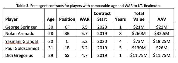 The players on this list are some of the best in the game and match well enough to Realmuto to make some comparisons. The average contract length is 3.8 years with an AAV of $21.9M. Another way to looks at Realmuto’s value is to compare him to other catcher contracts. Some notable catcher contracts are Joe Mauer 8 years/$184M, Buster Posey 8 years/$159M, Yadier Molina 5 years/$75M, and Yasmani Grandal 4 years/$73M. Those four contracts average 6.25 years with an AAV of $19M.
Value Estimate Realmuto’s high usage and the fact that he plays catcher in the NL means his contract length is probably 4-5 years, 6 at the absolute maximum. He is signing alongside a wave of higher value contracts and will use those as leverage to get an AAV between $23M and $25M. Things like no-trade clauses, player/team options, and incentives could factor in some but tend to be highly player and team specific so estimating those is more difficult. Realmuto has been an elite performer through his arbitration years and will finally reap the financial benefits that come with being a free agent. The Phillies will need to get out their checkbooks and make a deal before other teams get an opportunity and drive up the price. Summary J.T. Realmuto has established himself as the best catcher in baseball and is coming up on a contract negotiation the Phillies would like to finalize before the end of the 2020 season. His historical data shows a consistent, high performing offensive player with the ability to shut down the run game on defense. His one weakness is as a pitcher framer and even there he has shown consistent growth since being called up full time in 2015. Projections for Realmuto indicate his performance should be expected to continue for at least the next three seasons although the trade-off between his extreme durability and the toll of catching so many games could be a concern. A move to first base or the NL adding a DH would significantly add to his value long term and is something the Phillies should consider strongly. Using comparable players’ contracts Realmuto’s contract should be somewhere in the ballpark of 5 years and $120M. In a deal like this Realmuto would get paid appropriately for his performance, the Phillies would lock down another perennial All-Star, and the fans would be happy to see the front office building for continued success. Sounds like a win for everyone and it is reasonable to expect a deal to be made as quickly as possible once baseball resumes. References [1] Fangraphs Leaderboard -https://www.fangraphs.com/leaders.aspx?pos=all&stats=bat&lg=all&qual=y&type=8&season=2019&month=0&season1=2019&ind=0 [2] Baseball Savant Leaderboard – https://baseballsavant.mlb.com/statcast_leaderboard [3] J.T. Realmuto Fangraphs Page – https://www.fangraphs.com/players/jt-realmuto/11739/stats?position=C [4] Contract Information – https://www.spotrac.com/
1 Comment
In the last few weeks I have heard a number of ways Major League Baseball could adjust the schedule to get as many games in as possible this year. Two schedule changes that seem almost definite are increased double headers and less rest days. With the added toll that will take on players the commissioner’s office is likely exploring how these changes would affect injuries and ways to mitigate that risk. One option I have had proposed to me is the elimination of extra innings. Extra innings are taxing on a team’s bull pen and force managers to use relievers with less than optimal rest. This certainly increases injury risk and could be even more dangerous with more games played in a smaller window of time. This post will explore how eliminating extra innings would have changed outcomes over the last five seasons and how much of an impact that has on players and teams. In order for this idea to be viable it must not have a significant effect on the final standings and should show some promise for reducing relief pitcher usage. Effect on Individual Games One factor in evaluating the viability of this proposal is to see how many games would be affected and how much. The plots below show the number of games shortened and innings removed from each of the last five regular seasons. The average number of games shortened was 201 and the average number of innings removed in a season was 446. 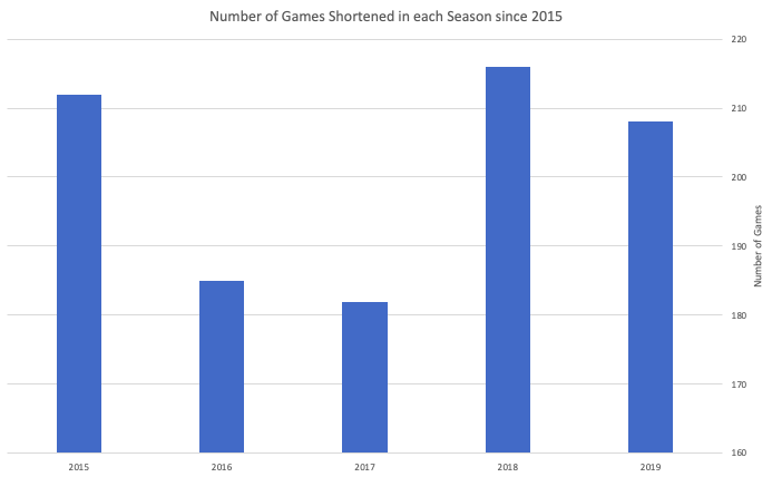 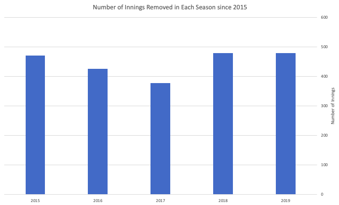 These numbers show the impact on individual games is fairly minimal. 201 games is just over 8% of the 2430 played in a normal regular season. If you divide the extra inning evenly among the 30 teams and assume every inning has both teams on defense that saves each team about 30 innings of pitching during the year. A regular reliever throws about 65 innings in a season so you’re saving half a reliever ‘s worth of work. This doesn’t fully capture the effect those 30 innings have on injury risk because it doesn’t consider the loss of rest days, but I don’t think 30 innings is an extraordinary amount. How much this change would decrease workload requires analysis outside the scope of this project. Effect on Standings and the Playoffs Teams and fans could stomach shortened games, but I doubt shifting the divisional standings and playoffs would be received well. The image below shows the 2019 final standings and scrolling right on the image will show how the standings would have changed with ties added to the equation. In my analysis winning percentage was calculated using a tie as half of a win. In 2019 there were two changes in divisional rankings and two changes to playoff seeding but all ten teams to start the playoffs were the same. The table below shows a summary of the post season changes in each season. This analysis shows that eliminating extra innings does have an impact on standings and playoff teams/seeds. Every season except 2015 had a pair of teams or more swap seeds and 2015-2017 had one team replaced each year. However, no team that made their League Championship or the World Series were eliminated, although the path to get there may have changed. 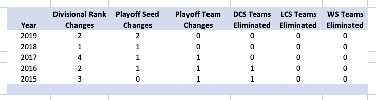 I also took a look at which teams were helped and hurt the most by this change. The results are shown in the tables below. 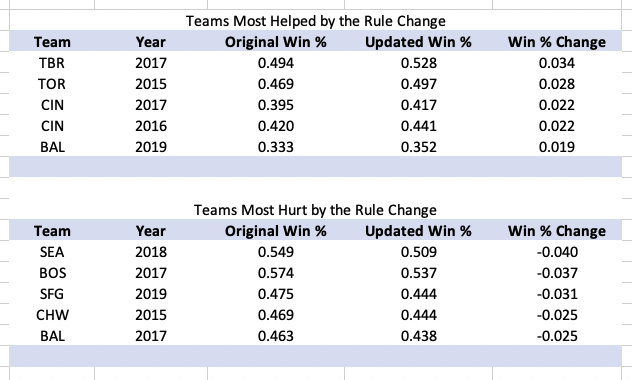 Poor teams tend to be helped by the change the most and only the 2017 Red Sox made the top five list of teams hurt by the change that made the playoffs. (They dropped from AL East champions to the top Wild Card slot.)
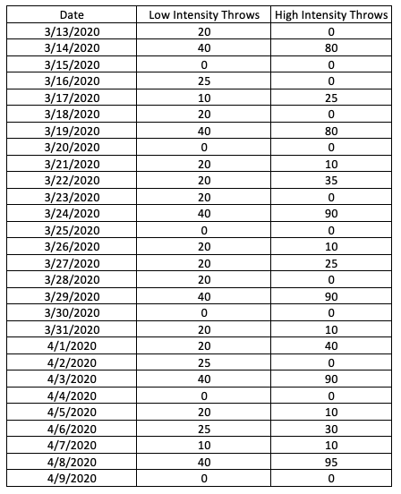
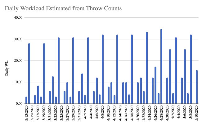
Eliminating extra innings does impact regular season standings and those changes will likely have playoff implications in the early rounds. Conclusions This initial assessment of eliminating extra innings seems to indicate it may not be the best way to alleviate the impact of a condensed regular season. In the past five seasons the benefit of reduced innings for relief pitchers is not nearly as large as the impact on the standings. Extra double headers and less rest could swing this comparison closer to even, but much more research would be needed to know for sure. A more reasonable and easily implemented change would be to expand rosters to the full 40 players so long games wouldn’t wreak so much havoc on a bull pen. Another argument in favor of this proposal is that it would shorten games. This argument is valid as a normal inning takes about 20 minutes and we all know extra innings don’t move with the same speed as a normal inning. Additionally, managers would change their approach in the 9th inning in consideration of a tie which could create extra action and excitement at the end of games. My opinion is that this would create a more pleasant fan experience but not everyone would agree. Improved fan experience combined with additional injury risk research could create enough justification for the idea and extra innings to be eliminated until the playoffs, but I do not expect the league to consider such a radical change even in these circumstances. Operating under the assumption that the regular season will be shortened, every game will carry increased importance for making the post season. This creates competing motivations for teams. They want to get their top pitchers going as quickly as possible to be competitive but ramping up too quickly could force time on the IL and cause more time to be missed compared to shortened or skipped appearances early on. As teams try to return to normal operations following the coronavirus shutdown ensuring player safety needs to be a point of emphasis. The loss of oversight and management of workload during Spring Training especially puts pitchers as risk, similar to the risk they are exposed to leading up to and during the first weeks of Spring Training. The graphic below shows a projected workload increase for a pitcher followed by the loss in chronic workload they would experience if they don’t continue throwing after the shutdown. I would expect players to keep throwing in some capacity, however, a player could just as easily go the other direction and overload themselves leading to injury during the shutdown. Teams are somewhat in the dark on how much and how often each player is throwing during this time and the injury risk associated with those choices leading into the season.  Ideal Workload Monitoring The ideal process would be to issue each pitcher a Motus sleeve and sensor and have them collect their own workload data. Teams could see this data and help scale workouts remotely creating an “at-home Spring Training”. Based on my experience at Motus, there are limited teams who have the capacity to do this. There aren’t enough sensors for everyone, players don’t know how to collect and download data accurately, and the organizational infrastructure doesn’t exist to manage a project like this on such short notice. Fortunately, there is a way teams could estimate workload and help ensure pitchers aren’t being exposed to more workload than they can handle. I will outline that method, walk through an example, and point out the challenges/shortcomings it presents to teams. Estimation Methods Workload can be estimated using throw counts and the specific player’s average torque measurement. This means all a pitcher needs to do for the organization is count their throws each day and record them. A bonus would be to break the counts by low and high intent so two different torques could be used and weighted. I would tell players to classify throws using this guide: Low Intent – warmup/cool down and long toss expansion under 120 feet High Intent – long toss over 120 feet and bullpens Important Note: Throw Counts are NOT the same as Pitch Counts. Every throw needs to be included in a workload calculation for it to provide value. Brian Goelz summarizes the importance of this difference best in a recent blog post he did for Driveline “every throw counts and not all throws are equal.” Warmup, expansion during long toss, and cool down throws are just as important to workload as bullpen sessions. This is also why breaking up throw counts by intent adds value to the estimation. For this method I am assuming the player has not used a Motus sleeve lately and their workloads (acute and chronic) are not being tracked. If those assumptions are false, this process can be much more accurate and daily throw volumes can be projected and adjusted in real time for the player since testing after the shutdown won't be needed. I will not go through this process because I don’t believe there are many teams in this situation. There are three steps to calculating workload values using the estimation method: 1) Estimate acute and chronic workloads before the shutdown using the player’s throwing schedule. (Same as Step 2 but using team throw counts/estimates) 2) Calculate daily workload values using player reported throw counts and average torque measurements. 3) Calculate current acute and chronic workloads and identify any need for additional on ramping and any injury risk exposure from spikes in ACR during the shutdown Once these steps are complete a team will have an estimation of where each player stands and where they need to be allowing for proper workload management and mitigation of injury risk. For reference before starting an example, here are the target values for a healthy starting pitcher on Opening Day: Chronic Workload – 15 to 20 Acute/Chronic Workload (ACR) – 1.0 to 1.3 Example (All Throw Data Estimated) Step 1 - The player’s workloads prior to March 12 when the shutdown began are estimated using the organization's throwing protocols and league average torque values. These estimates can be updated once torque values for the player are collected after the shutdown ends. The table below shows where the example player stood on March 12. 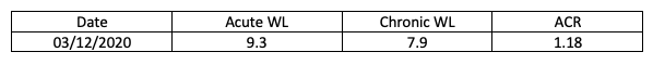 Step 2 - The player reports throw counts shown in the table and plot below:
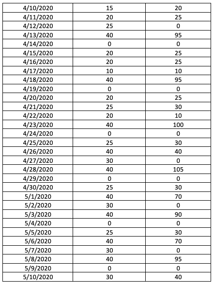
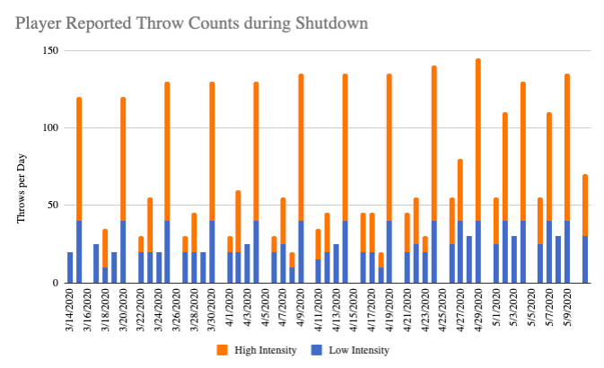 Upon return and use of a Motus sleeve, the following average torques are measured for the player and converted to a coefficient using Motus’ formula which normalized for height and weight: 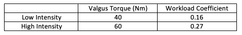 Using these tables, the daily workloads shown in the table and plot below can be calculated using the following equation: DailyWL = 0.16*Low_Intensity_Throws + 0.27*High_Intensity_Throws
 Step 3 - Daily Workloads are used to create rolling weighted averages for Acute (7-days) and Chronic (28-days) Workloads. The table below shows each metric starting on March 13 but these values use the estimates from all of Spring Training as well. 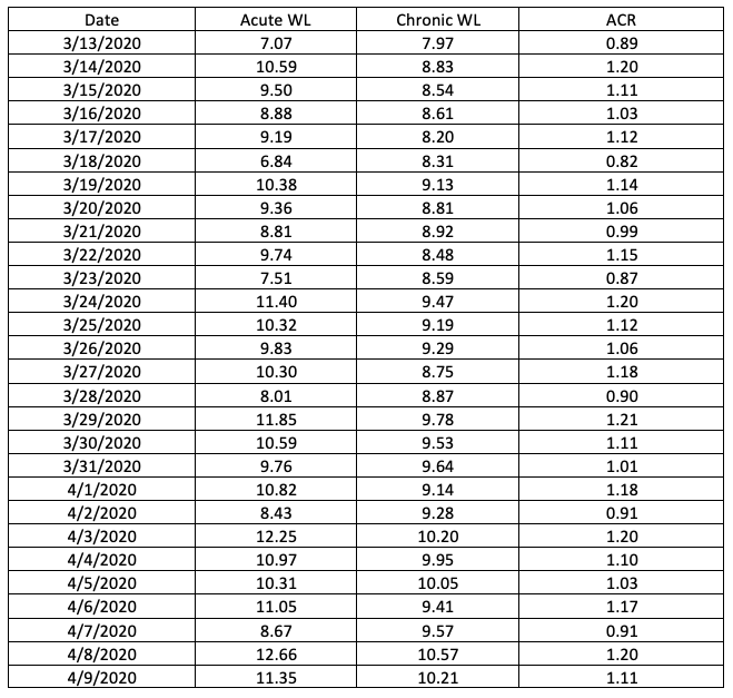 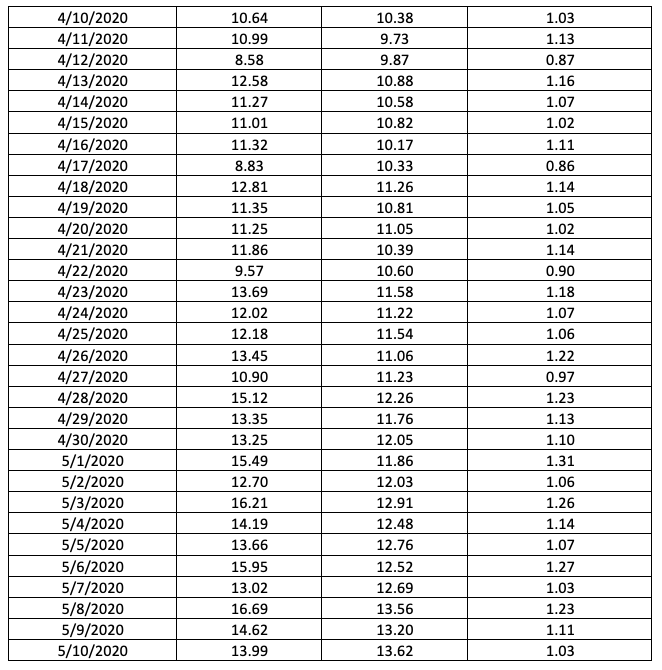 The plot below shows the player’s Chronic Workload and ACR throughout the spring with the shutdown period shaded grey. 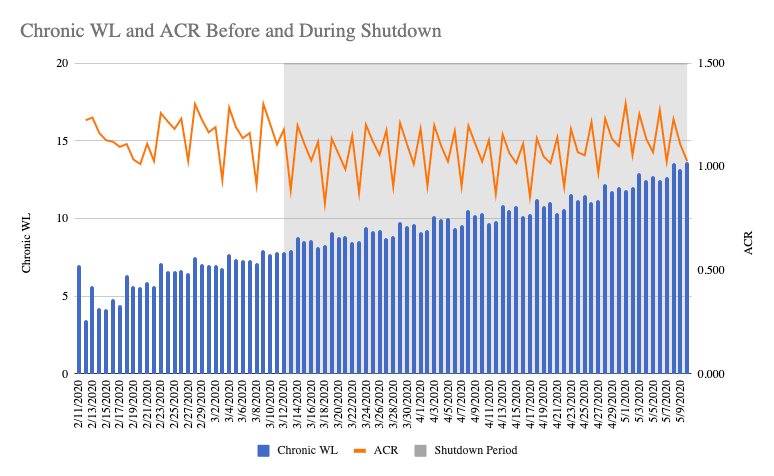 Assessing Workload and Injury Risk
The player did a good job managing ACR but was not aggressive enough in building Chronic Workload without team oversight. He ended the shutdown with an ACR of 1.09 and a Chronic Workload of 13.62. He maintained a safe on ramping pace (no ACR spikes above 1.3) but is behind schedule for Opening Day. In this case it would be best to continue projecting ACR and Chronic workload to determine how often and how long the player can throw until his Chronic workload is at least 15. I projected forward being as aggressive as possible and without exceeding an ACR of 1.3 and the player was ready for a "full" start on May 28, 18 days after my projected end to the shutdown. This may be about when competitive baseball begins but that projection relies on no setbacks during a period of fairly intense training. Potential Shortcomings The main shortcoming of this method is that the team is relying on players to count throws accurately and to “tag” them as low and high intent correctly. The reason wearing a Motus sleeve for all throws is so useful is because it measures each throw individually and the intent is continuous instead of using the bins and averages discussed. The workload estimates from during Spring Training are also subject to error unless teams to an exceptional job counting each player's throws. Additionally, the lack of estimation until after the shutdown ends exposes pitchers to high risk during the shutdown. Under ideal circumstances, and use of a Motus sleeve, an accidental day of overwork could be addressed with extra rest, but in this case the player won’t know if they have pushed too hard outside of the normal gages like soreness or injury. This method only allows teams to reactively address workload mismanagement instead of proactively tracking and adjusting. Conclusion Teams are now in a position where the risk of injury to their pitchers is elevated. Additionally, the specific risk for each player is unknown due to the lack of workload oversight during the shutdown period. Using a single Motus sleeve collection session and player reported throw counts broken down by low and high intent, teams can estimate a pitcher’s Chronic Workload and ACR allowing for adjusted management during the early weeks of the season. By implementing this process, a team may lose length or quantity of appearances a pitcher makes early in the season, but prevent extended IL stints or catastrophic injuries to their pitching staff ultimately increasing their chance of success in 2020. The table below shows my 2020 regular season projections for team record. The projections were created using team performance data from 2015 to 2019. Additionally, I gathered 2020 team performance projections from fangraphs.com using the data provided for each team like is found here for the 2020 Phillies. Update: It was kindly pointed out to me that my projections had given out more wins than was possible in a single season. Please see the final "Update" section to see how I modified my predictions to address this issue and how it changed my predictions. The table below is updated to reflect those changes. 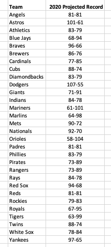 Having 2020 projections gave me some statistics to use for my 2020 predictions that account for roster changes, player development, and players regressing to their true skill level (up or down). The effects of roster changes season-to-season was something I was particularly interested in and this was one option I came up with that would reflect any major movement of players. Unfortunately, this is also the greatest flaw in this model. Past seasons' projections are not available so the model is trained using the actual performance in the same season. Therefore I am relying heavily on the accuracy of the 2020 projection data I feed into the model which may not be a good assumption to make. This all introduces some look-ahead bias and should be addressed in future iterations of the model. Model Summary The model is built using multiple linear regression with features selected using recursive feature elimination (RFE) and parameters tuned using grid search and cross-validation. The original features provided to the model are based on what statistics fangraphs projected for 2020. The following features were provided for the training data: Previous Season (eg. for 2019 predictions this is 2018 stats) Batting Average On-base Percentage Slugging Percentage wOBA Batting & Base-running Runs BsR Defensive Runs WAR from Position Players K/9 BB/9 HR/9 BABIP for Pitchers LOB % ERA FIP WAR from Pitchers Team Win Total Current Season (eg. for 2019 predictions this is 2019 stats) Batting Average On-base Percentage Slugging Percentage wOBA Batting & Base-running Runs BsR Defensive Runs WAR from Position Players K/9 BB/9 HR/9 BABIP for Pitchers LOB % ERA FIP WAR from Pitchers These features were then tested using RFE with mean average error as the scoring system. Following this feature selection analysis, the following features were used in the final remaining models: Batting Average in Previous Season On-base Percentage Batting Average BABIP in Pervious Season Slugging Percentage BABIP wOBA ERA wOBA in Pervious Season Slugging Percentage in Pervious Season On-base Percentage in Previous Season LOB % These features seem reasonable to use for projections. Some features like wOBA and previous season BABIP make sense and likely would have been used if features were hand-picked while others, like previous season batting average are less expected. My next step in model training was cross-validation and parameter tuning. I used a grid search and 5-fold cross validation on team win totals from 2016-2018. I held out the 2019 data to do a final test and evaluate the performance. The results of that test are shown in the table below. (Table below shows values before update and scaling discussed later). 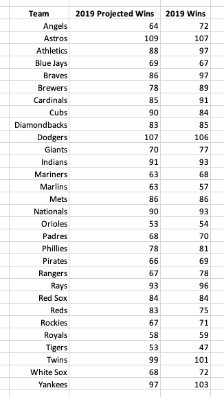 The mean average error for the 2019 predictions was 4.26 games. The model did a good job with teams that had especially good and bad seasons. The largest error was 11 wins and all three teams (Braves, Brewers, and Rangers) outperformed their projections. I felt good about this MAE value and performance overall so I decided to move forward to 2020 predictions. I combined all of the data from 2015-2019, trained the model a final time before making predictions for 2020. (Table below shows values before update and scaling discussed later). 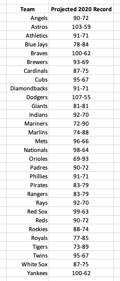 Update: Scaling to 2430 Total Wins It came to my attention that the original projections I created did not have a limitation on how many wins could be earned across the league. In my 2019 projections there were only 2356 wins and in my 2020 projections there were 2665 wins, 235 more than is possible. This meant that I needed to find a way to scale my win totals to match a 2430 game season. Upon looking at my data I also noticed that my projections skewed a little high. The lowest win total in 2020 was 69 wins but in 2019 there were four team below 60 wins. With this in mind I decided to scale my wins by penalizing poor teams' projections more than good teams' using their projected ranking. Subtracting the natural log of the team's ranking eliminated 75 wins so I scaled that to match the 235 wins I needed to eliminate in 2020. Using the natural log allowed for the worst team to be penalized the most with decreasing effects as a team's ranking increased. These steps and the number of wins removed for each team in 2020 are shown below. 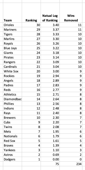 The effect of this change on my predictions was not insignificant. Some teams lost as many as 11 wins. The old and new predictions for 2020 can be seen in the table below. 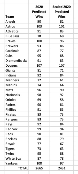 Similarly, 2019 predictions were changed to add the missing 74 games. This change improved my model performance decreasing the MAE from 4.5 to 3.8. The table below shows those changes and the actual 2019 win totals. 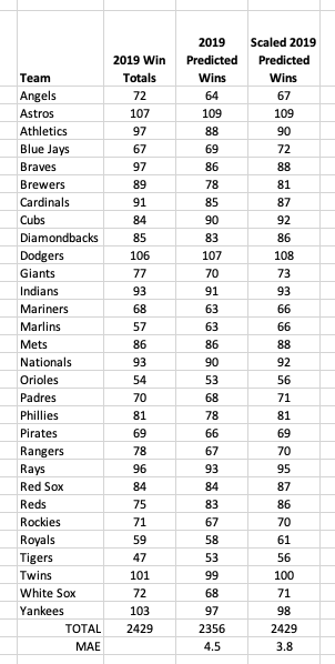 Only time will tell if these predictions are any good. I will follow up in the winter with an assessment and any updates I am planning for the 2021 season.
Updated: This post was updated to more accurately capture the effects increased exit velocity would have on player value. My original calculations applied the increase in xwOBA to all balls in play which over estimated the impact on performance and player value. The increase in xwOBA should only be applied to balls that are hard hit as this is where improved outcomes are observed. As teams continue to focus their player development programs aiming to get the most value out of a player possible it will be important for them to identify which traits they want to focus on and how that will effect the player's value to the team. Working off of this idea I wondered, "What would happen to a player's value if he could add 1 mph of exit velocity to his batted balls?" This post will explain my approach to making this conversion from miles per hour to dollars and show why a hitting program that develops increased exit velocity would add tremendous value to a player or major league organization. I will also discuss some approaches to increasing exit velocity I would pursue if developing a program myself. Overview of Methods My jump from EV to dollars takes three steps using a combination of historical Statcast data, linear regression, and some conversion values worked out by others in the baseball community. Briefly, here is what I found: 1) +1 mph of exit velocity on well hit balls (more on that below) increases xwOBA by 0.012. 2) xwOBA relates to Batting Runs (R^2 = 0.621) using the equation delta_BattingRuns = 274.2*delta_xwOBA. That's an increase of 3.26 Batting Runs using the value from Step 1. 3) +10 Batting Runs = +1 WAR and +1 WAR = $9M A 1 mph increase in exit velocity adds roughly 0.326 WAR and increases a player's value by $2.9M. If this is all you need to see then you can skip the details of my analysis below. Even a fraction of this would be worth developing a training program focused around exit velocity as I am sure more and more teams will be doing. Exit Velocity to xwOBA Expected weighted on-base average (xwOBA) uses exit velocity (EV) and launch angle (LA) to predict the wOBA value of a ball in play. This makes xwOBA a perfect statistic to gauge how a change in EV effects a player's skill level. From the Baseball Savant website: "xwOBA is more indicative of a player's skill than regular wOBA, as xwOBA removes defense from the equation. Hitters, and likewise pitchers, are able to influence exit velocity and launch angle but have no control over what happens to a batted ball once it is put into play." In order to determine how much xwOBA would increase, I took a look at Statcast data for all balls in play from 2017-2019. My code allowed for this data to be broken into bins for any interval of EV which in this case was 1 mph. Using the mean difference between each bin I was able to estimate the overall value of an increase in EV. However, the image below (image source: mlb.com) shows that an increase in exit velocity doesn't effect outcomes until balls are hit hard. 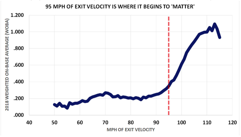 MLB classifies a ball as "hard hit" if the EV is greater than 95mph. I used this cutoff to focus on balls in play that would be positively impacted by an increase in EV. Because of this cutoff it is also important to consider the MLB average hard hit rate. In recent years this has been approximately 35% of balls in play. Using this filtered data set I calculated the average increase in xwOBA an additional 1 mph of EV would create to be 34 points. However, to add this to a player's xwOBA the value needs to be scaled down to reflect the increase only occurring for those 35% of hard hit balls. This changes the increase in xwOBA to 12 points. For some context, in 2019 xwOBA for players with 100 PA or more ranged from 0.196 (Jeff Mathis) to 0.455 (Mike Trout) and the MLB average was 0.319 which is roughly the skill level of Albert Pujols. xwOBA to Batting Runs Now that an increase in EV has been converted to xwOBA I needed to convert it to something more easily related to player value. My initial attempts centered around WAR, but I was unable to find a correlation that I was happy with. However, WAR is comprised of Batting Runs, Base Running Runs, and Fielding Runs in addition to some other adjustments outside the player's control. Exit velocity only effects a player's Batting Runs and that is where I made the connection to xwOBA. This is a great conversion because Batting Runs is essentially wOBA adjusted for plate appearances, league factors, park factors, etc. To model how an increase in xwOBA would effect Batting Runs I used a linear regression between the two on all players with more than 100 PAs in the 2017-2019 seasons. This gave me 1320 data pairs between the player's xwOBA and Batting Runs. The plot below shows the results along with the line of best fit (R^2 = 0.621). 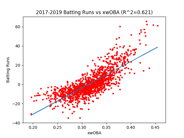 A little bit of rearranging of variables gave me the constant needed to convert a change in xwOBA to Batting Runs:
delta_BattingRuns = 274.2*delta_xwOBA Plugging the expected increase in xwOBA of 0.044 into this equation I project 3.26 Batting Runs added from a 1 mph increase in EV. Mike Trout led major league baseball with 61.0 Batting Runs in 2019, and Jeff Mathis had -30.6 Batting Runs. However, the nicest thing about using Batting Runs is that it converts to WAR very easily so context isn't really important. Batting Runs to WAR and Player Value Now that the increase in EV has been converted to Batting Runs the final two steps are fairly straight forward. Batting Runs is one component of WAR and therefore you only need to divide the Batting Runs value by Runs per Win to get it into WAR. Using Fangraphs as reference, I divided Batting Runs by 10 to give 0.326 wins added just from increasing EV. In 2019, WAR ranged from 8.6 to -2.1 (no need to tell you who those values are from) meaning 0.326 WAR is a significant difference in performance. The final step in assessing an exit velocity increase's effect on player value is converting WAR to dollars. Fangraphs uses $9M per win giving a change in player value of $2.9M. That's $2.9M of added value per season per player if a training program can increase exit velocity by 1 mph. An organization who is confident in a training program can consider this into all levels of player development including signing free agents at a steep discount. Starting Points for Increasing Exit Velocity The first and most important part of developing a program is gathering and tracking data to monitor progress and refine programs based on what generates desired results. Systems like Rapsodo/Trackman/HitTrax are likely already in place at all major league facilities and capture hitting sessions so exit velocity is always being measured. This system also monitors launch angle which shouldn't be ignored throughout the training program and for some players may be more important than exit velocity. As this Driveline article nicely explains, there are four components to exit velocity, and training programs can directly improve two of those: bat speed and contact quality (collision efficiency). An improvement of bat speed and/or contact quality should increase exit velocity so those will be the focus of different aspects of the training program. Contact quality is difficult to measure directly but bat speed can be monitored as often as possible using a Blast Motion bat sensor. Having data on bat speed and exit velocity will give feedback on overall progress as well as insight into where a player is improving in their swing. There are now three areas the program is focused on and we have a way to directly measure two, giving insight into what is working and what isn't. Programs can then be adjusted for individual players and their deficiencies and new tools can be introduced and tested for efficacy. To start, here are some technologies/training methods worth exploring: Blast Motion - monitors bat speed and other swing metrics Axe Over/Underload Training Bats - developed and used at Driveline to improve bat speed PlyoCare hitting balls - developed at Driveline to give feedback on and train contact quality Vizual edge - vision training to help ball tracking and (maybe?) improve contact quality K-Vest - swing analysis tool to improve kinetic chain timing Motus MX - full body motion assessment tool to monitor and identify mobility deficiencies Additionally, a Motus study showed increasing pelvis rotational energy correlated to an increase in bat speed and Driveline uses a velocity based training program in the weight room to improve player explosiveness. Using these technologies and others, a team could build a data-driven hitting program focused on increasing exit velocity and dramatically increasing player value in the process. To see code from my analysis please visit: https://github.com/koby-a-close/EVIncrease Just before the 2019 MLB trade deadline Nick Castellanos was traded from the Detroit Tigers to the Chicago Cubs. With the trade, Castellanos moved from what would ultimately be the worst team in baseball in 2019 to a Cubs team making a postseason push and finishing with 37 more wins than Detroit. Castellanos' wOBA increased by 0.077 and his wRC+ increased from 105 to 154. It appears that moving to a team filled with more talent and more motivation to win caused his performance to improve but is that true for all players such that an increase in performance could be predicted? This post will use all trades from the 2017-2019 MLB trade deadlines to investigate this idea. Collecting Data This project required more manual data collection than I have done in the past and I started by getting all of the players who were traded in "trade deadline deals" from 2017 to 2019. To do this I relied heavily on sports reporting and its accuracy. In total there were 49 position players and 78 batters to analyze. Once a list was collected I needed to gather performance statistics from each player before and after they were traded. Fangraphs.com had all the information I needed and I selected two statistics for batters and two for pitchers to use in the analysis. For batters I used wOBA as a general measure of a player's hitting ability and wRC+ in an effort to control for changes in park effects. The statistics I used for pitchers were FIP- and SIERA. Both stats measure a pitcher's underlying skill level and adjust for park factors. I also collected each team's final winning percentage in each season as a way to quantify if a player moved to a better or worse team and by how much. Using end of season winning percentages is a rough estimate since the player may effect that outcome themselves but it was significantly easier than collecting records before and after each trade for each player given I was collecting data manually. Analysis The analysis on the data required a difference between the player's performance statistic to be compared to the difference in the winning percentage of the two teams he played for that season. My assumption was that an increase in team winning percentage would result in an increase in player performance. Example Calculation from Nick Castellanos in 2019: Old Team: Detroit Tigers, 0.292 Win % New Team: Chicago Cubs, 0.519 Win % wOBA with Tigers: 0.331 wOBA with Cubs: 0.408 Change in Win % = 0.519 - 0.292 = 0.227 Change in wOBA = 0.408 - 0.331 = 0.077 These calculations were done with each player and statistic in python (https://github.com/koby-a-close/PerformanceChanges_AfterTrade) and then plotted and checked for any trends using ordinary least squares. The following slideshow shows the results for all four statistics with the OLS line. Results
None of the statistics used showed any trend or statistical significance. The R^2 values were: wOBA: 0.009 wRC+: 0.009 FIP-: 0.037 SIERA: 0.008 Based on this analysis there is no predictable change in performance when a player is traded mid-season based on the record of the new and old teams. This makes a lot of sense mainly because playing for the Cubs instead of the Tigers does not change the true skill level of Nick Castellanos and the same is true for all players. Park factors could be significant but I attempted to control for those effects in my statistic selections. Other factors also play into the equation that are much harder to analyze like clubhouse fit, increased pressure to perform, and personal adjustments to new cities. Additionally, half a season is a very small sample size and the noise in data was significant. Practically this means that predicting a player's performance after a trade is best done using projections for the season using large amounts of historical data. Considering non-data driven factors is an art and will depend on the individual involved. More statistics for individuals and teams could be tested but I doubt any significant would be found. Good players tend to play well and poor players tend to play poorly. In The Book: Playing the Percentages in Baseball, the authors investigate batter-pitcher matchups using a number of different statistics to see if choosing matchups using those statistics give either side an advantage. The statistics used are handedness, GB/FB rate, BB/K rate, contact rate, and player quality. This post re-examines those statistics using data from 2017-2019 to see if the trends observed hold true in 2019. Data Background In the original analysis, data was used only from batters and pitchers with 800 PAs or more between 1999 and 2002. That allowed for 340 batters and 314 pitchers and their matchups to be analyzed. To try and replicate the analysis as best as possible, I used all batters with 800 PAs or more from 2017 and 2019 and all pitchers with 200 IP from 2017 and 2019. That allowed my analysis to have 295 batters and 194 pitchers. All statistics for classifying players were collected from fangraphs.com and play-by-play data was collected from baseballsavant.com. Only matchups between qualified players were used in the analysis. Re-examining Statistics used in The Book Handedness Observations from 1999-2002 data: • 39 point swing in wOBA • Left-handed batters benefit more than right-handed batters by 11 points • Pitchers benefit equally from having the advantage (20 points) • Teams are using the information and get a left-left matchup in 28% of at-bats Observations from 2017-2019 data: • 47 point swing in wOBA • Left-handed batters benefit more than right-handed batters by 9 points • Left-handed pitchers benefit more than right-handed pitchers by 21 points • Teams get a left-left matchup in 25% of at-bats and have increased left-handed pitcher use overall The main difference in the data is the extra advantage left-handed pitchers are getting. There are more left-handed pitchers now (31%) than from 1999-2002 (24%), but the percentage of left-handed batters that left-handed pitchers face has decreased from 28% to 25%. This indicates that there are more lefties pitching but teams are using them less for spot relief against a left-handed batter. This has led to more at-bats against right-handed batters inflating the advantage lefties get from facing a left-handed batter. As baseball works to decrease the number of pitching changes in a game this decrease in left-left matchups will likely continue but the value of a lefty who can get outs against everyone will too. Key takeaways: • The platoon advantage from handedness still exists and has increased since 2002 • Left-handed pitchers are being used more overall but less to get specific left-left matchups Note: It is not clear how the authors divided players for classification in the original work but for my analysis I used 25th and 75th percentiles as cutoffs. For example, a hitter with a FB/GB rate above 1.46 (75th percentile) was considered a flyball hitter and a hitter with a FB/GB rate below 0.94 (25th percentile) was considered a groundball hitter. All other hitters were labeled 'neutral'. The same process was used for pitchers and on all other statistics used from here on out. Due to this unknown in the original data, any specific comparison cannot be made between the datasets. I will only note if the trends are the same or different and focus my analysis on data from 2017-2019. Groundball/Flyball Tendency Observations from 1999-2002 data: • 32 point advantage in wOBA • Flyball hitters performed better than groundball hitters regardless of the matchup • Pitchers gained an advantage from facing hitters with the same GB/FB tendency • Teams were not using this information although most batters and pitchers are classified as neutral so choosing a matchup is more difficult than with handedness Observations from 2017-2019 data: • 48 point advantage in wOBA • Flyball hitters hit best against groundball pitchers (32 point advantage) while groundball hitters hit best against flyball pitchers (16 point advantage) • Teams don’t appear to be using this information to get a higher percentage of advantageous matchups The main change observed is that flyball hitters are no longer the best hitter regardless of the matchup. This could be because players are now more focused on a swing or pitch type leading to more polarity among matchups. For example, flyball hitters might be what we now consider launch angle hitters. They are highly skilled at getting the ball into the air and overcoming a groundball pitcher's sinking pitches but are also more likely to pop-up or swing and miss against a flyball pitcher's elevated fastball. This also explains why flyball hitters gain a larger advantage than groundball hitters. A mistake against a flyball hitter is more likely to be a home run or extra-base hit, elevating wOBA and making that matchup the most important for choosing a pitcher. However, teams do not appear to be using this information to make decisions. Against a flyball hitter 22% of at-bats were against flyball pitchers and 23% against groundball pitchers. Key takeaways: • The platoon advantage from GB/FB tendency still exists • Flyball hitters create the largest swing in advantage but don’t outperform groundball hitters in all matchups BB/K Rates (Controlling the Strike Zone) Observations from 1999-2002 data: • No platoon effect • Better control of the strike zone is better for both pitchers and hitters regardless of matchup Observations from 2017-2019 data: • No platoon effect Key takeaways: • Hitters with high BB/K and pitchers with low BB/K rates have better control of the strike zone and will perform better regardless of the matchup. Contact Rate Observations from 1999-2002 data: • No platoon effect • Lower contact players tend to perform better – hitters because of walks and pitchers because of strikeouts Observations from 2017-2019 data: • Low contact pitchers perform better than high contact pitchers - 40 points vs high contact batters and 69 points vs low contact batters • Batters perform generally the same regardless of matchup except for one – low contact batters vs low contact pitchers where low contact batters are 24 points worse than a high contact batter and 20 points worse than a neutral contact batter There isn’t really a platoon effect here, but there is change in overall trend compared to the 1999-2002 data. Low contact pitchers are still preferred in all matchups. They are typically the best pitchers and generate a lot of strikeouts. In the 2017-2019 data this group included Jacob deGrom, Max Scherzer, and Gerrit Cole. Low contact hitters are still elite – Aaron Judge, Josh Donaldson, and Bryce Harper fall into this category – but they are no longer the best performers in all situations and some of the game’s most elite hitters like Mike Trout and Alex Bregman are high contact hitters. Each group of hitters performs relatively equal (9 points or less) with the exception of the low contact hitter vs a low contact pitcher where there is a 25 point drop in wOBA. This is valuable insight given the emphasis on strikeouts and home runs across the league. A batter with low contact rates may struggle against elite pitching more than other players, even if they are a top tier batter themselves. Key takeaways: • Elite hitters can emerge in all contact rate categories • Low contact pitchers are the best performers and they especially take advantage of low contact batters Player Quality Observations from 1999-2002 data:
• No platoon effect • “Good pitching beats good hitting as much as good hitting beats good pitching.” Observations from 2017-2019 data: • No platoon effect Key takeaways: • Good pitchers decrease all batter performance equally just as bad pitchers increase all batter performance equally Conclusions The trends observed and analyzed in The Book allow teams to create matchups that give the hitter or pitcher a distinct advantage. However, the game has changed since 2002 and some of the trends discussed have changed when using data from 2017-2019. Handedness is still the main factor used by teams and provides a clear advantage, but groundball/flyball tendency could also provide teams with valuable matchup advantages and is still not being used on a wide scale. Contact rate shows that low contact pitchers are still the best in baseball, but a shift in batting has led to the elite hitters mixed between high, neutral, and low contact tendencies. There is much more data available to the public than there was in 2002 and more statistics should be explored to look for matchup advantages teams can easily use. What statistics do you think would be worth exploring? Batting average is not a particularly useful tool for player analysis, but it something that fans and commentators often use. I thought adding an end of season projection to that conversation would be interesting and attempted to build a model that could use data from March and April of a season to predict end of year batting average. This post will summarize my initial attempt, some things I have learned since then, and ideas to further improve model performance. Understanding the Data I had data for 300 random MLB players during the 2018 season. The only limitation on the list of players was there were no pitchers. The features were available for analysis:
In addition, I had the actual EoY batting averages for model evaluation. Before starting, I created a distribution plot of the March/April Batting Averages to see if the was a true random selection of the league. The distribution below looks good, and I assumed each of the other rows had normal distributions as well. 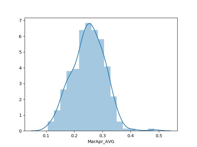 General Approach and Assumptions The first month of data for a batter is not a great indicator of full season success, so I needed to think about how I was going to approach this problem to account for players getting off to different starts. To do this, I applied the theory of regression to the mean. In this situation it means that everyone's final statistics will land somewhere between the league average and their performance in March/April. Applying this to just batting average was too simple, but applying it to the other statistics that are good predictors of batting average provides a more robust way to predict full season batting average. This assumption of regression to the mean gave me the general approach to this project: Step 1 - Identify statistics that are good predictors of batting average using March/April statistics and March/April batting averages Step 2 - Build a predictive model using those predictive statistics Step 3 - Regress those statistics from March/April to the mean as a way of projecting full season performance Step 4 - Use the regressed statistics to predict EoY batting averages Step 5 - Use the actual EoY batting averages to evaluate model performance Following these steps, I created and evaluated an XGBoost model to predict batting averages. I chose to use MAE as my key performance metric because it penalizes each error equally. This is ideal because a single player who significantly outperforms/underperforms expectations in a year is not uncommon but would make a model that otherwise predicts batting average well look poor. Additionally, MAE is easy to use to explain the model's performance. A MAE of 0.010 means each prediction will be 0.010 off on average. Summary of Model Built for Submission I followed the steps listed above to build an XGBoost model. I chose an XGBoost model because it typically outperforms more simple models and I have had success using it in the past. Step 1 - Identifying Predictive Features Of the statistics available, 16 were relevant to hitting performance and might be useful for model creation. I didn't want to use all 16 as that would make the model too hard to understand. To determine the best features, I build an XGBoost regression model will all 16 features and evaluated the gain each feature provided. I then looked for natural cutoffs in the feature importance. The feature importance from the full 16 feature model is shown below: 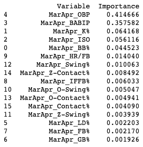 There were two natural cutoffs I could identify and I tested them to see how the MAE changed compared to using all 16 features. The first combination was OBP and BABIP only. All of the other features had much less gain than these two, but the MAE increased in this model from -0.0213 to -0.032. My next combination was OBP, BABIP, K%, ISO, and BB%. This combination had a MAE of -0.0205 which was better than using all 16 features. To ensure this was the best combination, I tried adding and subtracting a few features but ultimately decided the top 5 features was best. Step 2 - Building and Tuning the Model Now that I had my 5 features to use in the model, I needed to build and tune it so it would be ready to make predictions. Using some strategies for model tuning from a Towards Data Science article, I tuned the model using trial and error until MAE was optimized. This gave me the following parameters for my XGBoost Regression Model: learning rate = 0.05, number of estimators = 1000 max depth = 5 subsample = 0.8 gamma = 0 Step 3 - Regressing Statistics to the Mean With a model built, I needed end of year statistics to feed into it and make batting average predictions. I found league average values for each statistic online: OBP - 0.320 BABIP - 0.300 K% - 0.200 BB% - 0.080 ISO - 0.140 I then created a variable constant called 'Multiplier' for each player based on the number of plate appearances they had in March/April and an average number of plate appearances in a season. I estimated the number of plate appearances in a season to be 500. The Multiplier determined how much weight the March/April stats would have compared to league averages. This was important because a player with 100 plate appearances and good statistics is more likely to stay above average than a player with 10 plate appearances and good statistics. A higher Multiplier created this effect, regressing stats of those with high plate appearances less. For example, Elias Diaz only had 34 plate appearances while Manny Machado had 125. Diaz's multiplier was 0.068 while Machado's was 0.250. This causes Diaz's final stats to be 6.8% from his March/April performance and 93.2% from league averages. Machado's stats are 25% from from his March/April performance and 75% from league averages. I calculated a weighted average of the March/April stats and the league average using the variable Multiplier as the weighting constant. Step 4 - Making Final Predictions With my model from Step 2 and regressed statistics from Step 3, I made my predictions for EoY batting average. However, before comparing them to the actual results I wanted to make sure they made sense. I was concerned about the regression techniques I used and how they would effect the stats for each player. To see how they affected the predictions I looked at the range of values predicted and a distribution plot of the predictions. Ideally, the predictions would have a normal distribution and a range similar to the 2017 range which was 0.203 to 0.342 (0.139 range). 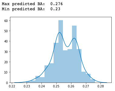 The values were more heavily regressed to the mean than I had expected and the distribution was not normal. This told me I was undervaluing the March/April stats. To adjust the regression effects, I changed the expected plate appearances from Step 3 to 100 which produced a good normal distribution. Then I pushed the value up slowly until I started to lose that normal distribution. I wanted the value to be as high as possible since 100 plate appearances weighs the March/April stats very heavily. I settled on a value of 180 which adjusted the range of predictions to 0.182 to 0.321 (0.139 range) while keeping a normal distribution. To compare to the original constant, Diaz's March/April stats went from having a weight of 6.8% to a weight of 18.8% and Machado's March/April weight increased from 25% to 69.4%. Once the weighting constant was adjusted, I reran the model to get my final predictions. The new predictions had a normal distribution and a range of 0.139. Below is the distribution plot and range for the adjusted weighting: 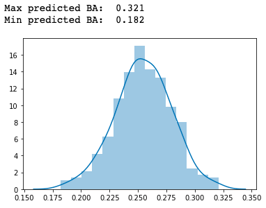 Step 5 - Evaluating Model Performance The final step was to compare the predictions to the actual full season batting averages. My primary evaluation was MAE which came out to 0.022. To help visualize my predictions I plotted the predicted values vs the actual values. 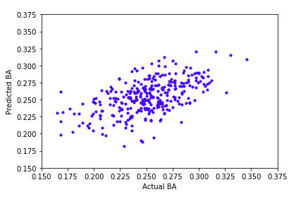 I also wanted to see if the model tended to overestimate or underestimate batting averages. The overestimate/underestimate ratio was 55%/45% indicating the model doesn't have any strong bias in one direction. The performance of the model wasn't great. The difference of 22 batting average points can be significant over the course of a season. However, Sarah R. Bailey, Jason Loeppky, and Tim B. Swartz did a study comparing Statcast and PECOTA predictions for 2017 batting average that performed similarly. PECOTA's MAE was 0.0236 and Statcast's was 0.0209. Those values indicate this model is performing in the same range as other batting average prediction models. Learning from the Experience After completing the first XGBoost model I have learned more about modeling and reflected on how I could have done a better job. Input from others as well as reading about how others have made useful prediction models using baseball data have led me to the following main points of learning. - Check simpler models to consider the tradeoff between model performance and interpretability with XGBoost. (More on this below) - Feature selection can be done iteratively and visualized looking for a point of diminishing returns. I happened to pick a good combination but the process could have been easier and more mathematically sound. - Model tuning can be done efficiently using Random Grid Search instead of guess and check techniques. This is all about efficiency and ensuring the best combination of parameters is selected. The main takeaway from my learning is to check on performance of easier to interpret models before using XGBoost. XGBoost can improve model performance, but in situations like this it can be very helpful to understand what is driving a model to predict things the way they do. There isn't a set rule on when to choose which model, but it is good to check and see if the ambiguity of XGBoost is worth increased performance. This is especially true for this project after I checked the performance of some multiple linear regression models and found them to perform equally as well, if not better than, my XGBoost model. These models are much easier to understand, so using one of them would have been a better decision. Below is a comparison of the model performance for my original XGBoost model, a multiple linear regression model using all 16 features, and a multiple linear regression model using the same 5 features as the XGBoost model: 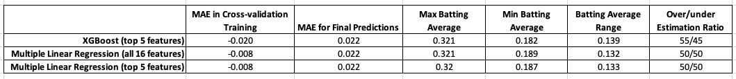 Although it is disappointing to see that I clearly made the wrong choice for a model in this situation, it has provided a valuable lesson for me moving forward.
Further Model Improvements The MAE score for all three of the models I created was 0.022. This would not be an ideal score if this model were to be implemented within an organization. In order to improve model, two improvements could be made: 1) Use each player's historical averages for regression instead of league averages. This would work especially well with OBP, K%, BB%, and ISO because they have been shown to have a strong year-to-year correlation which means they stay consistent for each player and therefore we can expect each player to regress to their own averages with more confidence than the league average. For a stat like BABIP, the year-to-year correlation is much lower, so a league average would be better. This more personalized model would likely give better results, especially for players who have stats significantly different than league averages. 2) Add additional stats and see if they became top features and improve final predictions. Statcast data like exit velocity and launch angle would be two features I would start with as they have been shown to be good indicators of hitter talent. Sources The following sources were used in my creation of the original model: becominghuman.ai (https://becominghuman.ai/understand-regression-performance-metrics-bdb0e7fcc1b3) - using MAE for model performance evaluation Beyond the Boxscore (https://www.beyondtheboxscore.com/2011/9/1/2393318/what-hitting-metrics-are-consistent-year-to-year) - year-over-year correlation of hitting statistics Beyond the Boxscore (https://www.beyondtheboxscore.com/2017/12/26/16815098/babip-mlb-batting-average-on-balls-in-play-stats-statcast) - BABIP league average Fangraphs (https://library.fangraphs.com/offense/rate-stats/) - K% and BB% league averages Fangraphs (https://library.fangraphs.com/offense/iso/) - ISO league average Fangraphs (https://library.fangraphs.com/offense/obp/) - OBP league average Medium (https://medium.com/human-in-a-machine-world/mae-and-rmse-which-metric-is-better-e60ac3bde13d) - choosing MAE for model performance evaluation The Prediction of Batting Averages in Major League Baseball by Sarah R. Bailey, Jason Loeppky and Tim B. Swartz (http://people.stat.sfu.ca/~tim/papers/sarah.pdf) - using Statcast data to predict batting averages and a comparison for MAE performance pydata.org (https://seaborn.pydata.org/tutorial/distributions.html) - distribution plot code Towards Data Science (https://towardsdatascience.com/fine-tuning-xgboost-in-python-like-a-boss-b4543ed8b1e) - tuning a XGBoost model The Houston Astros are a league leader in using data analytics to identify and develop talent. Recently, their use of spin rate has become more public and the success they have had finding pitching talent speaks for itself. There is more to the Astros' success than finding players with certain spin rate characteristics, but it is likely the first step they take when evaluating pitchers. With the 2020 season wrapping up, I wanted to look ahead to the free agent pitchers and see if any are good fits when using this method of assessment. Using Past Astros Acquisitions to Identify an Ideal Pitcher Profile There are numerous articles and reports to get started building a profile that the Astros prefer. Here are a few articles that discuss the Astros' preferences and how they use those pitch characteristics to be successful: Highest Team Spin in 2017-2018 - https://www.crawfishboxes.com/2018/5/3/17316840/digging-into-the-data-astros-spin-rates Ryan Pressly's Transformation - https://www.theringer.com/mlb/2019/6/3/18644512/mvp-machine-how-houston-astros-became-great-scouting Gerrit Cole's Transformation - https://fivethirtyeight.com/features/how-gerrit-cole-went-from-so-so-to-unhittable/ From this information I identified some characteristics the Astros are using to look for pitching potential: - Above average four-seam fastball spin - Above average curveball spin - High use of a below average two-seam fastball/sinker, especially with poor performance To validate these characteristics and their utility in identifying pitching talent, I looked at the pitchers on the Astros 2019 ALCS roster that were acquired after 2015 when spin rate data became available. There were seven pitchers who met these criteria, and Joe Smith was removed because he throws from a sidearm slot. Below is a breakdown of the pitchers used for the initial analysis and when they were acquired by the Astros: Pitchers Traded for: Justin Verlander - 2017 Gerrit Cole - 2018 Ryan Pressly - 2018 Roberto Osuna - 2018 Zack Greinke - 2019 Pitchers Signed in Free Agency: Hector Rondon - 2017 To analyze the Astros' preferences for a high spin four-seam fastball I used Statcast data for each player 2 years before joining the Astros, and all available data since. I also used league wide pitch data from 2017 to 2019 to get a league average and standard deviation spin rate (2270 +/- 175 rpm). The figure below shows the results: 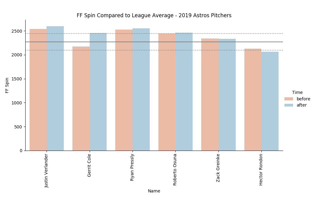 The data on four-seam fastball spin rates provides the following insights: - 4 of the 6 pitchers had spin rates greater than the league average before joining the Astros, and 3 had spin rates more than one standard deviation greater than the league average. - 5 of the 6 pitchers had spin rates greater than the league average after joining the Astros, and 4 had spin rates more than one standard deviation greater than the league average. I used the same analysis methods to look at curveball spin rates. To make the analysis a little easier, I combined all pitches tagged as a Knuckle Curveball into this category. The league average values were 2505 +/- 295 rpm. The following figure shows the results: 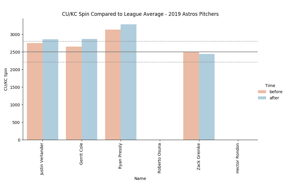 Hector Rondon and Roberto Osuna don't throw a curveball so their spin rates were zero leaving only 4 pitchers for comparison. The data on curveball spin rates provides the following insights: - 3 of the 4 pitchers had spin rates greater than the league average before joining the Astros, and 1 had a spin rate more than one standard deviation greater than the league average. - 3 of the 4 pitchers had spin rates greater than the league average after joining the Astros, and 3 had spin rates more than one standard deviation greater than the league average. The final characteristic identified in the articles focused on two-seam fastballs/sinkers. This characteristic really has three parts: - Spin rate. With a two-seam fastball pitchers actually want lower spin to generate more downward movement. The league average values were 2148 +/- 175 rpm. - Use rate. A pitcher who uses an above average spin two-seam fastball will have more to gain by using it less. - Poor performance. I used wOBA because it is readily available with Statcast data. I analyzed two-seam fastball data for each of the six Astros pitchers in those three categories, seen in the figures below. 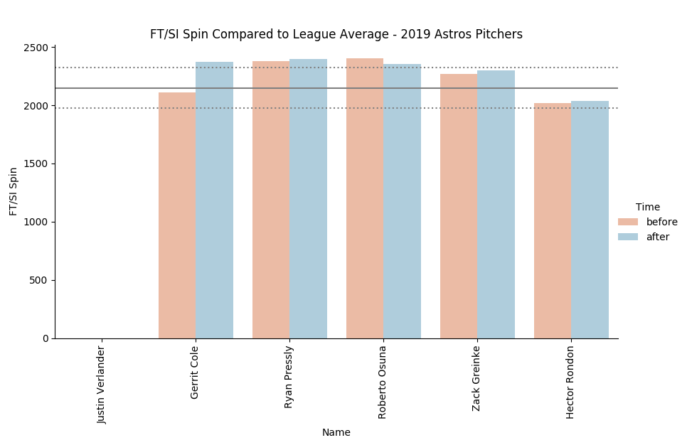 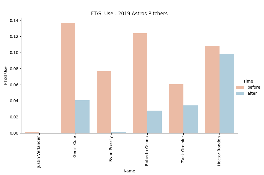 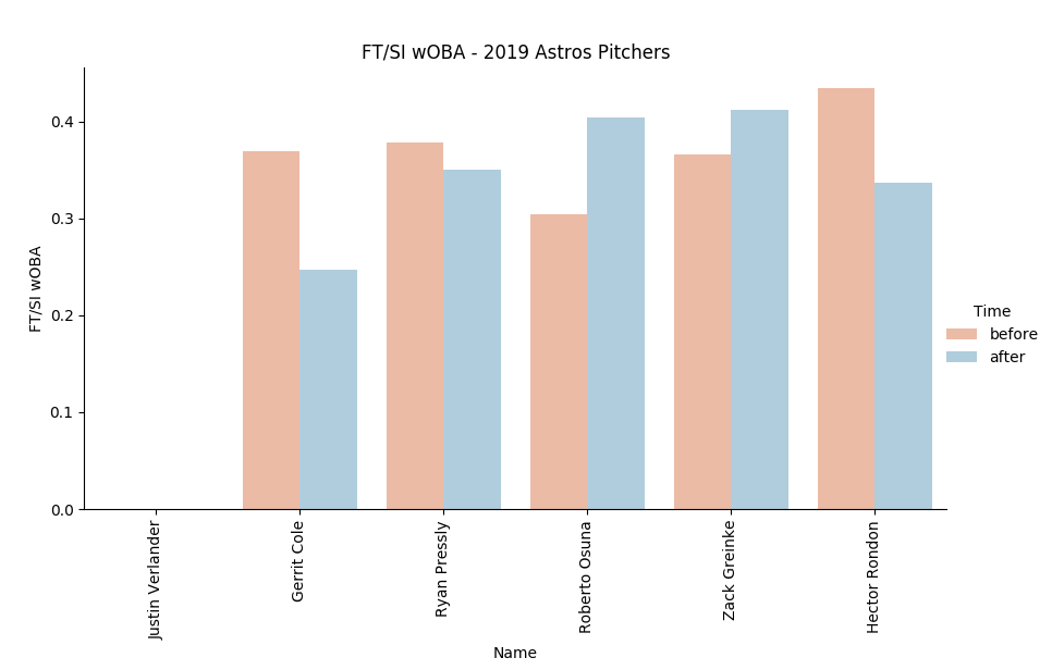 Justin Verlander doesn't throw a two-seam fastball so there are only 5 pitchers to compare. Looking at the three sets of data together we can see some common trends: - 3 of the 5 pitchers had two-seam fastball spin rates that were higher than the league average and 2 had spin rates greater than one standard deviation (175 rpm). - All 5 of the pitchers have decreased their two-seam fastball use, and everyone except Hector Rondon have decreased their use significantly. - All 5 of the pitchers had high wOBA on two-seam fastballs before joining the Astros indicating the pitch was not effective. Using the four-seam fastball, curveball, and two-seam fastball data together we can validate the pitcher profile identified in the articles. With the exception of Justin Verlander and Hector Rondon, all of the pitchers were using a two-seam fastball that was ineffective. Spin rates were high, use was high, and wOBA was high for that pitch. After joining the Astros, two-seam fastball use decreased. The Astros instead had those pitchers rely on their high spin four-seam fastball and curveball. Justin Verlander doesn't throw a two-seam fastball but had exceptional spin rates on his four-seam fastball and curveball. Even Zack Greinke, whose spin rates were around league average, decreased use of his least effective pitch. These characteristics helped the Astros identify pitching potential and build their pitching staff. Identifying Free Agents that Match the Pitcher Profile Now that the characteristics were validated, I wanted to see if any of the 2020 free agents matched this profile and could benefit from a change in approach. I wanted to find pitchers who met all three criteria. These pitchers will have the most to gain and therefore offer the most value. There are 47 starters and 53 relievers on the mlb.com list of potential 2020 free agents so I broke them into groups of 10 to keep the graphs readable. I will present them below (as a slide show) using the past two seasons of data for each pitcher and the same methods as above. You can look through each figure yourself or skip to the end and see the pitchers I identified and a closer look at their numbers. Four-seam fastball spin rate data: Curveball spin rate data: Two-seam fastball spin rate: Two-seam fastball use data: Two-seam fastball wOBA data: To filter through all 100 pitchers, I tried various filter combinations that gave me a short list of pitchers. Ultimately I landed on parameters that required a pitcher to have either an elite four-seam fastball or curveball and two-seam fastball characteristics that indicate decreased use would benefit them. The parameters used were: - Four-seam fastball spin in the 75th percentile or better (> 2388 rpm) OR Curveball spin in the 75th percentile or better (> 2704 rpm) - Two-seam fastball spin greater than the league average (> 2148 rpm) - Two-seam fastball use greater than 10% - Two-seam fastball wOBA greater 0.300 This cut the list down to 10: Yu Darvish Adam Wainwright Rick Porcello Jake Arrieta Corey Kluber Edinson Volquez Trevor Cahill Steve Cishek Tommy Hunter Arodys Vizcaino This group's four-seam fastball data: 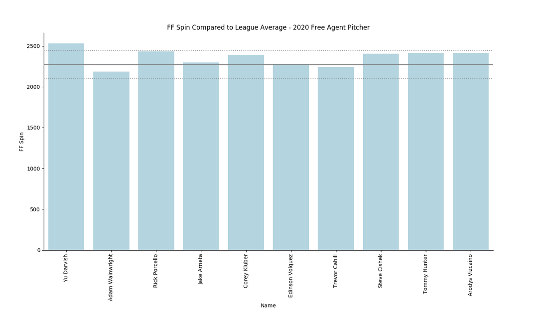 Adam Wainwright and Trevor Cahill's four-seam fastball spin is below the league average which could be problematic for this profile. I will eliminate them from further analysis. All of the other pitchers have good spin on their four-seam fastballs which meets the ideal pitcher profile. Yu Darvish, Rick Porcello, and Tommy Hunter have especially good four-seam fastball spin. Curveball spin data: 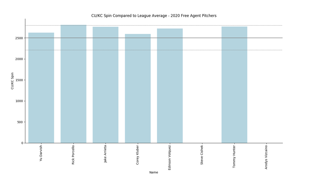 Steve Cishek and Arodys Vizcaino don't throw a curveball. They don't exactly fit the Astros profile I've identified and will be eliminated from further analysis. Further analysis into their other pitches could still make them attractive to a similar process, but that is outside the scope of this post. Rick Porcello and Tommy Hunter have good four-seam fastball spin and also have good curveball spin. Jake Arrieta also has curveball spin that is well above the league average. Two-seam fastball spin data: 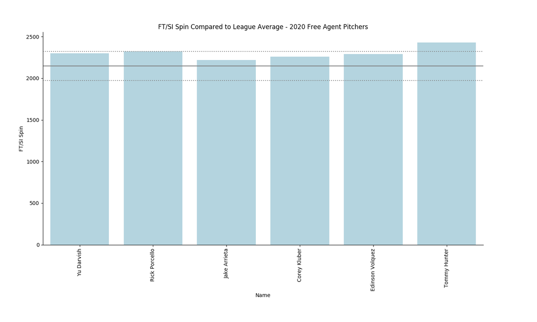 Everyone's two-seam fastball spin is high because of the filter I used, so this metric doesn't provide a ton of insight into potential gains. However, Rick Porcello, and Tommy Hunter have especially poor spin on their two-seam fastballs. Combining this information with two-seam fastball use and wOBA will be more insightful. Two-seam fastball use data: 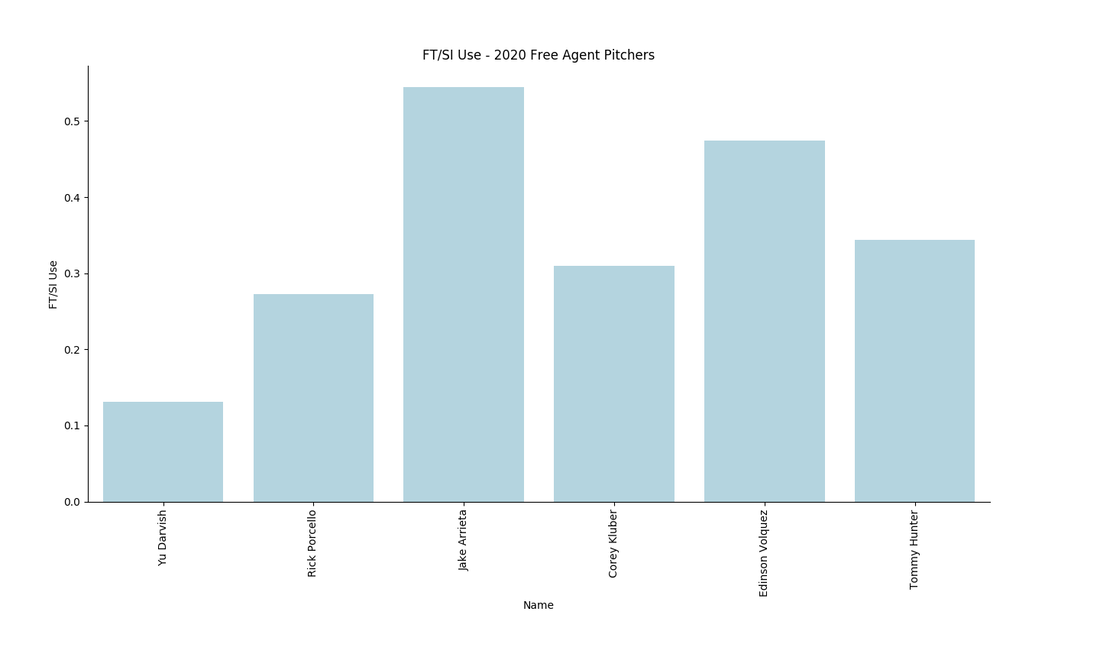 Yu Darvish uses his two-seam fastball the least out of this group and therefore might have the least to gain from a decrease in throwing his two-seam fastball. Jake Arrieta used his two-seam fastball more than 50% of the time and would require to greatest change in approach. Two-seam fastball wOBA: 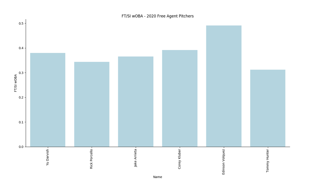 wOBA on two-seam fastballs were all poor - again because of my filtering process - but Edinson Volquez has especially poor performance. Everyone in the group had a higher wOBA on two-seam fastball than overall. Eliminating two-seam fastball use for a more effective pitch or pitches would benefit their performance.
Based on this assessment I've ranked the top 5 'Astros Type' free agent pitchers for 2020. Each pitcher has above average spin on four-seam fastballs and curveballs and would benefit greatly from decreasing use of a poor two-seam fastball. 1 - Rick Porcello 2 - Tommy Hunter 3 - Edinson Volquez 4 - Yu Darvish 5 - Jake Arrieta Closing Thoughts The ability to teach higher or lower spin rates would give a team a huge edge in player development and identifying high value players who could improve their spin rates on certain pitches. Gerrit Cole saw increased spin rate on his four-seam fastball after joining the Astros. He attributes this to adjustments in grip and release but the spike has caused controversy around the league. Spin is currently considered a trait that isn't alterable, but more research with high speed cameras like Edgertronic or Rapsoto could crack the code to perfecting a pitch's spin rate. Identifying these characteristics is far from all the Astros do. Pitchers have to commit to changing their pitch selection. Additionally, locating a fastball up in the zone, like the Astros prefer, requires solid command and confidence from a pitcher. Maybe the Astros or another team will sign one of these pitchers this offseason and convince them to change their pitching style. I think it would benefit their career and in turn the team who signs them. More analysis could be done on this group of pitchers. Steve Cishek and Arodys Vizcaino might have great spin on their sliders and adding slider spin could reveal other potential pitchers. Additionally, the Cubs have implemented an approach that is exactly the opposite, focusing on pitchers with especially low spin two-seam fastballs and changeups which leads to better movement in the bottom of the zone. A club could optimize each pitcher based on their spin profiles and find great value in the free agent market. Who do you think I missed as a high spin pitching target this offseason? Each play in the playoffs holds extra weight compared to the regular season. An error can change a game and a loss can doom a series. In close games and series, it is often the team that executes the small plays that comes out on top. A particular play in Game 2 of the NLDS between Washington and Los Angeles stood out in this context: Asdrúbal Cabrera singled to right field, driving in Ryan Zimmerman. However, the throw from the outfield held up Kurt Suzuki at third base and Cabrera was thrown out trying to advance to second base on the throw. Although the Nationals still won the game, the base running error was not inconsequential in the series. Evaluating the Result with WE and RE24 Two statistics - Win Expectancy (WE) and RE24 - can be used to show why trying to advance was a bad decision. Win Expectancy is the probability a team will win given the specific circumstances. Greg Stoll's Win Expectancy Calculator [1] shows how different base running outcomes by Cabrera change Washington's WE in Table 1, below. 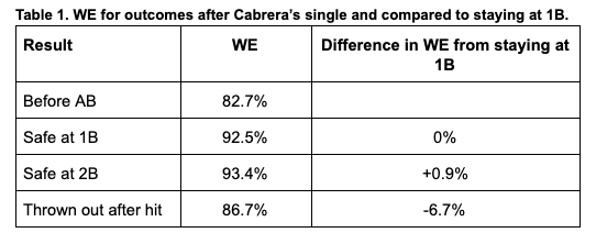 The Nationals' Win Percentage before Cabrera's single was 82.7%. The highest WE is 93.4% and results when Cabrera gets to second base, however, staying at first only decreases Washington's WE by 0.9%. In comparison, getting thrown out decreases WE by 6.7% compared to staying at first. A 0.9% increase in WE is not worth risking 6.7%, especially in a playoff game where you have the lead. RE24 captures the change in Run Expectancy (RE) while considering runs scored during the play. RE is the same concept as WE except focusing on the probability of a run being scored instead of a team winning the game. The equation for RE24 is:  Using Fangraphs' RE24 matrix the change in run expectancy can be evaluated. Results are shown in Table 2. 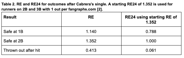 RE24 also shows how risky Cabrera' base running was. Making it to second increases his RE24 by 0.212, but getting thrown out decreases it by 0.727. Staying at first would have given the National's a good opportunity to score more runs and pad their lead in a big road playoff game.
Burning Scherzer in Relief It is easy to dismiss this base running error because the Nationals won the game and were never really at risk of losing after. In fact, their WE never dropped below 80% for the rest of the game. But the difference in a close win and a blowout win can be huge later in the series. Dave Martinez used ace Max Scherzer (2.45 FIP) in relief in the bottom of the 8th inning to shutdown the Dodgers. This puts his projected start Sunday in question and could cause Anibal Sanchez (4.44 FIP) to start in Scherzer's place. A bump Sunday means everyone gets pushed back and either Patrick Corbin (3.49 FIP) or Stephen Strasburg (3.25 FIP) only makes one appearance in the series. If Cabrera stays at first, Washington has a better chance to score more runs in the 8th inning. If they do, maybe Martinez skips Scherzer in relief and the three man rotation remains intact for Games 3-5. There is no way to know the direct effect of Cabrera's base running error, but in the playoffs execution of baseball fundamentals become all the more important. Washington will need to avoid more mistakes like these if they want to knockoff the NL favorite Dodgers. Sources [1] Greg Stoll's Win Expectancy Calculator - https://gregstoll.com/~gregstoll/baseball/stats.html#V.-2.8.1.7.0.0 [2] Adjusting RE24 for baserunning - https://tht.fangraphs.com/adjusting-re24-for-baserunning/ [3] RE24 - https://library.fangraphs.com/misc/re24/ |